📚강의록📚/유노코딩)CSS
CSS 기초 06(grid속성 align-content/justify-content)
과부하가즈아
2023. 8. 3. 20:13
🔴align-content
🔴justify-content
align-content & justify-content
flex box 방식과 유사하게 사용한다. grid container의 수직축과 수평축에서의 item 정렬 방식을 결정한다. container에 여유 공간이 있을 때 사용할 수 있다.
⭐내용실습⭐
<!-- index.html-->
<!DOCTYPE html>
<html lang="en">
<head>
    <meta charset="UTF-8">
    <meta name="viewport" content="width=device-width, initial-scale=1.0">
    <link rel="stylesheet" href="style.css" />
    <title>그리드 레이아웃</title>
</head>
<body>
    <ul class="container">
        <li class="item">1</li>
        <li class="item">2</li>
        <li class="item">3</li>
        <li class="item">4</li>
        <li class="item">5</li>
    </ul>
</body>
</html>
/*style.css*/
*{
box-sizing: border-box;
}
body{
margin: 0;
}
ul{
padding: 0;
list-style-type: none;
border: 5px solid teal;
}
li{
display: flex;
justify-content: center;
align-items: center;
background-color: beige;
border: 5px solid tomato;
border-radius: 8px;
}
.container{
display: grid;
height: 500px;
grid-template-columns: repeat(3, 100px);
grid-template-rows: repeat(2, 100px);
}
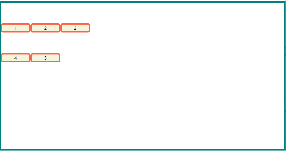
여유 공간을 확인하기 위해서 item의 값을 100px로 지정했다.
align-items는 트랙 안에서의 배치 방법
align-content는 컨테이너 전체 안에서의 배치 방법

align-content
.container{
display: grid;
height: 500px;
grid-template-columns: repeat(3, 100px);
grid-template-rows: repeat(2, 100px);
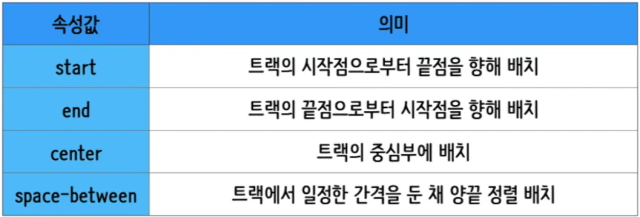
align-content: start;
}
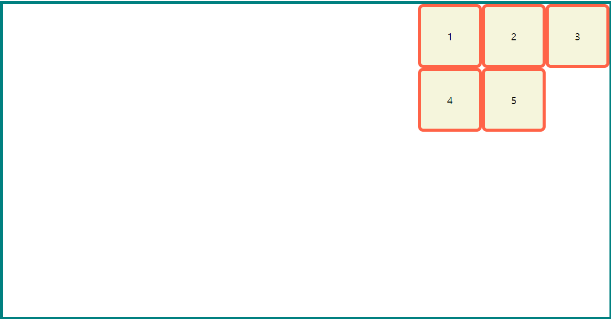
align-content: end;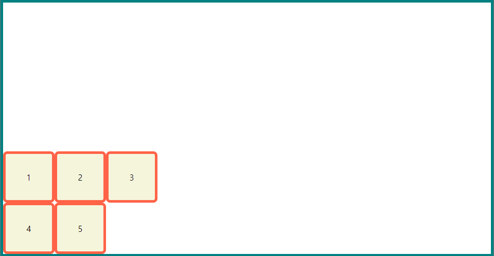
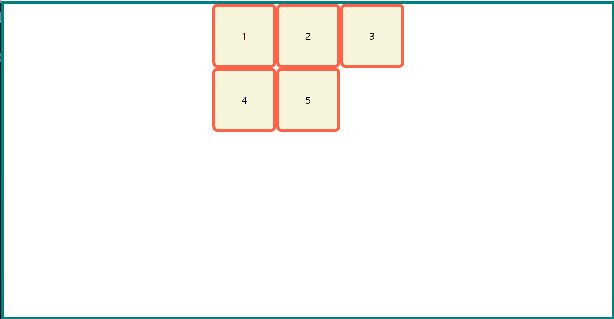
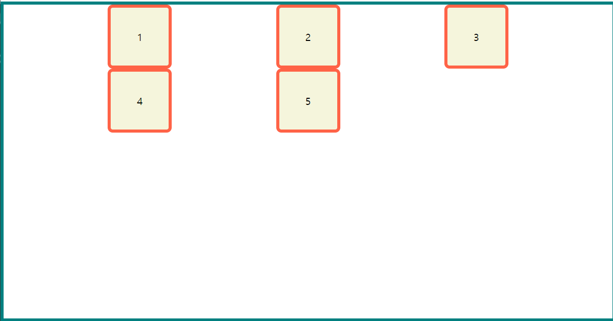
align-content: center;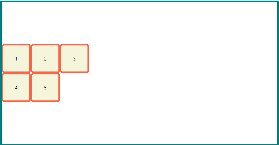
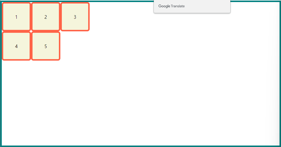
align-content: space-around;
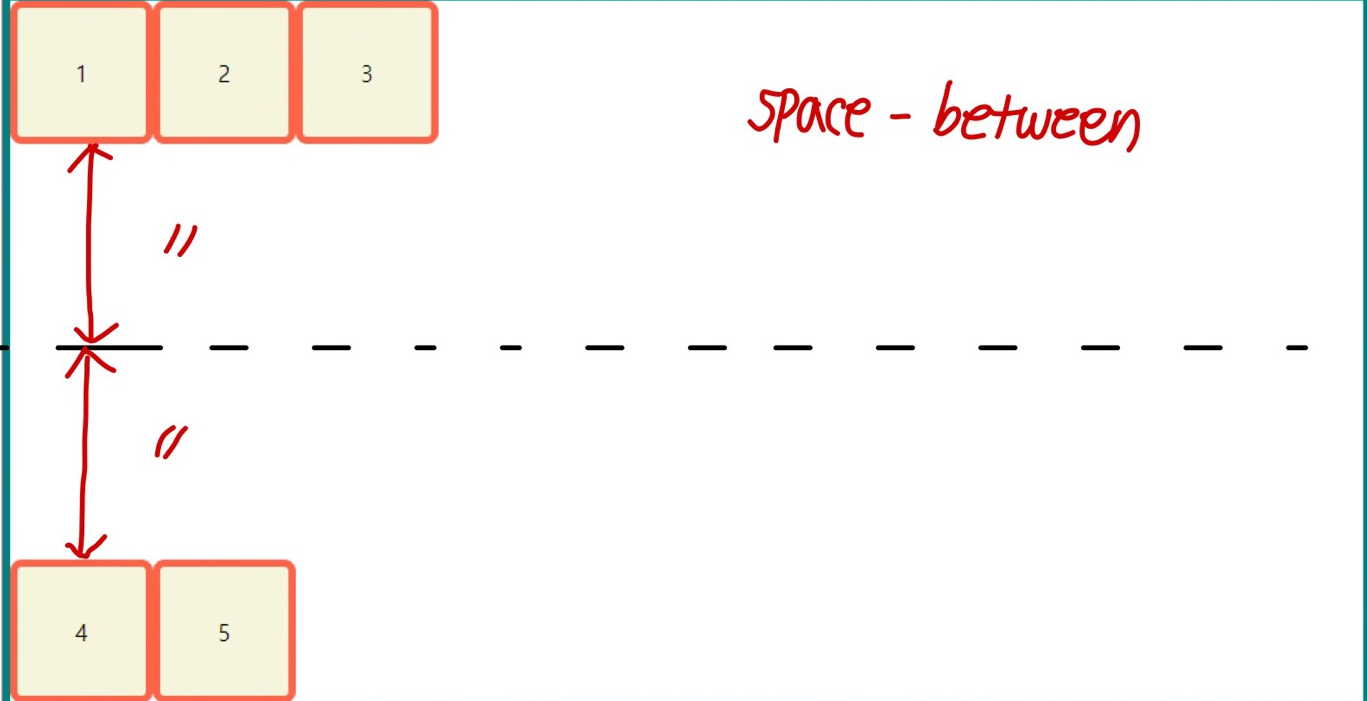
align-content: space-between;
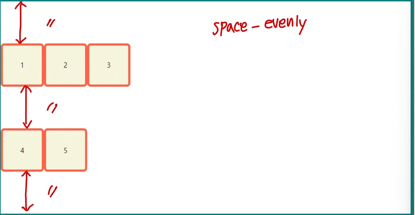
align-content: space-evenly;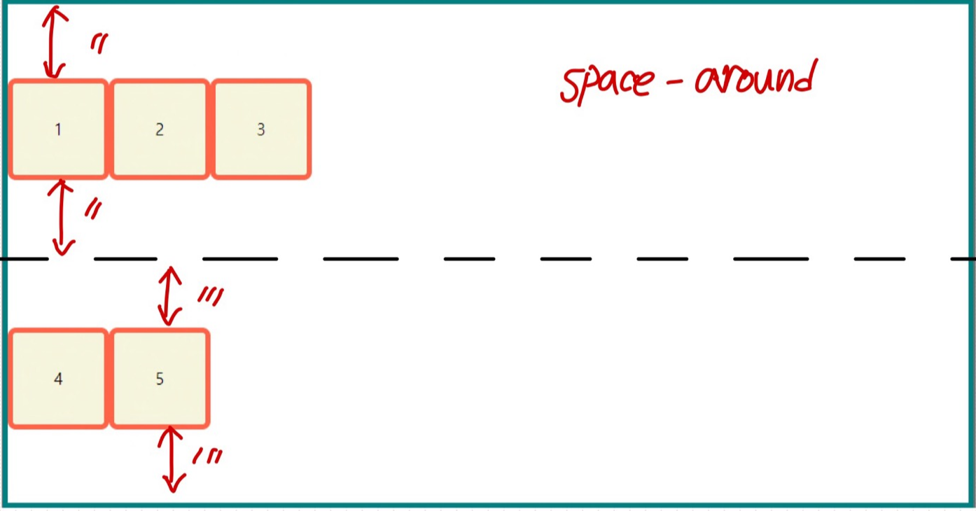
justify-content
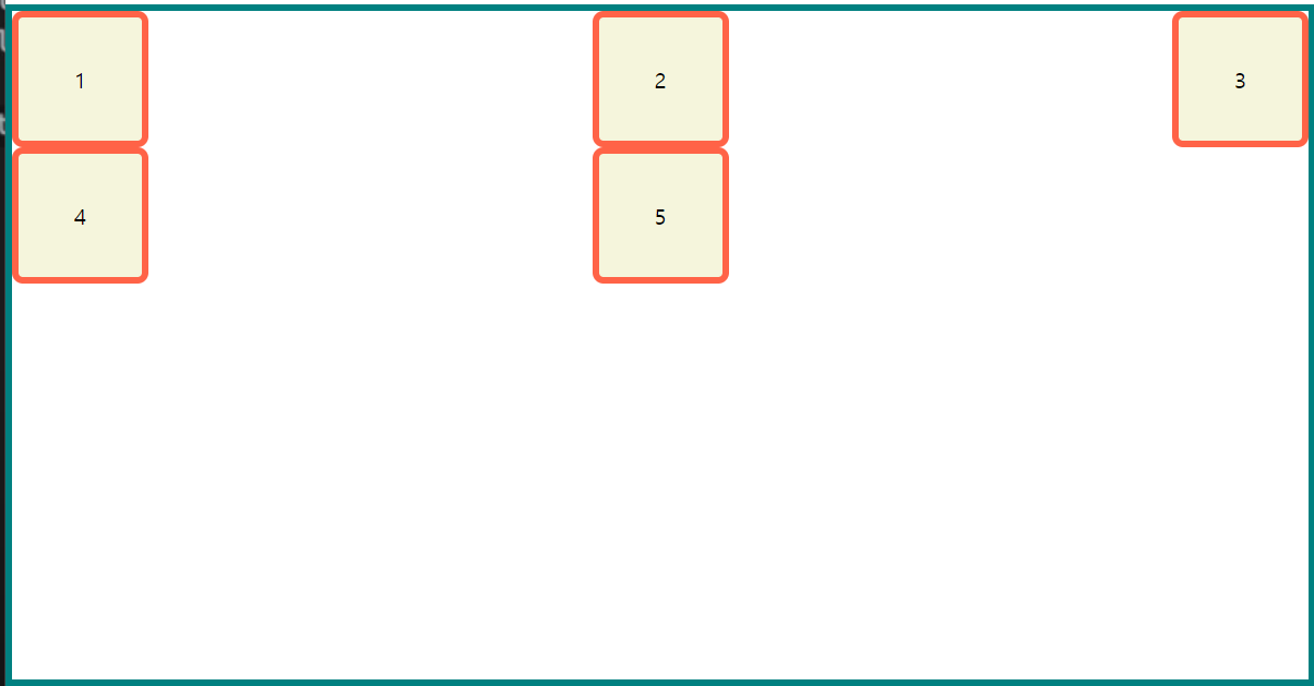
justify-content: start;
justify-content: end;
justify-content: center;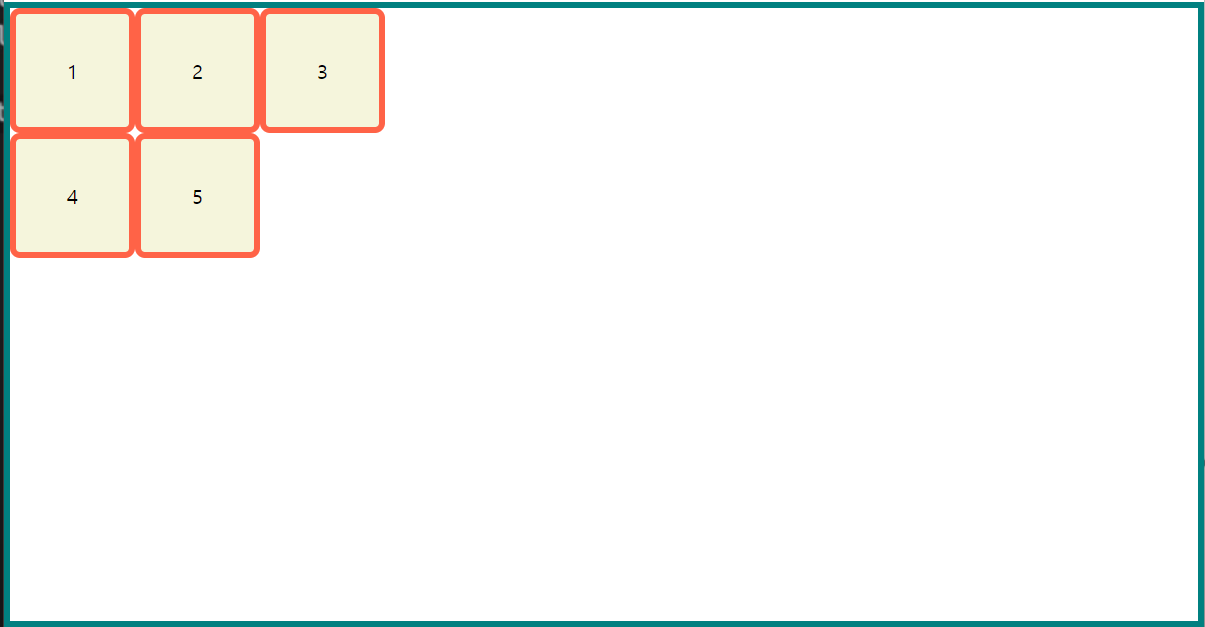
justify-content: space-around;
justify-content: space-between;
justify-content: space-evenly;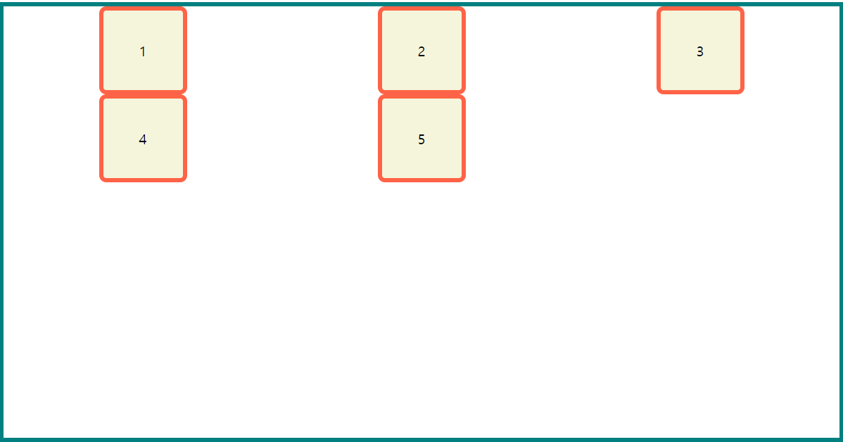
참고🖇️