📚강의록📚/유노코딩)CSS
CSS 기초 06(grid속성 align-items, self/justify-items, self)
과부하가즈아
2023. 8. 3. 17:30
🔴align-items
🔴align-self
🔴justify-items
🔴justify-self
align-items
flex box방식에서와 유사한 역할을 한다. grid container 행 트랙의 높이를 기준으로 grid item의 배치를 결정한다.
트랙
행과 열을 의미한다.
align-self
각각의 grid item이 어떤 식으로 배치될 것인지를 스스로 결정한다. (즉, item에 직접 지정하는 속성!)
justify-items
수평축(행)을 따라 grid item을 정렬하고자 할 때 사용할 수 있는 속성으로, grid container에 지정한다. 아이템에 할당된 열 방향 너비가 기준이 된다.
justify-self
수평축(행)을 따라 grid item을 정렬하고자 할 떄 사용할 수 있는 속성으로, 각각의 grid item에 지정한다. align-item, aliign-self의 관계와 유사하다.

⭐내용실습⭐
<!-- index.html-->
<!DOCTYPE html>
<html lang="en">
<head>
    <meta charset="UTF-8">
    <meta name="viewport" content="width=device-width, initial-scale=1.0">
    <link rel="stylesheet" href="style.css" />
    <title>그리드 레이아웃</title>
</head>
<body>
    <ul class="container">
        <li class="item">1</li>
        <li class="item">2</li>
        <li class="item">3</li>
        <li class="item">4</li>
        <li class="item">5</li>
    </ul>
</body>
</html>
/*style.css*/
*{
box-sizing: border-box;
}
body{
margin: 0;
}
ul{
padding: 0;
list-style-type: none;
border: 5px solid teal;
}
li{
display: flex;
justify-content: center;
align-items: center;
background-color: beige;
border: 5px solid tomato;
border-radius: 8px;
}
.container{
display: grid;
height: 500px;
grid-template-columns: repeat(3, 1fr);
grid-template-rows: repeat(2, 1fr);
}
li:nth-child(1){ }
li:nth-child(2){ }
li:nth-child(3){ }
li:nth-child(4){ }
li:nth-child(5){ }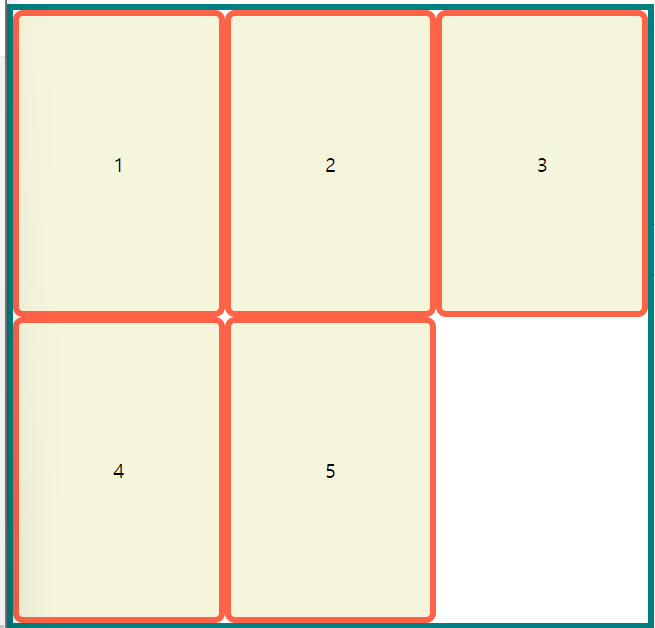
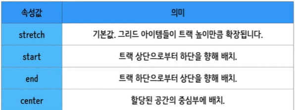
grid container에 align-items
.container{
  display: grid;
  height: 500px;

  grid-template-columns: repeat(3, 1fr);
  grid-template-rows: repeat(2, 1fr);

  align-items: stretch;

}
기본 값으로 아무 변화가 없다. item의 높이만큼 자리를 자치함!
align-items: start;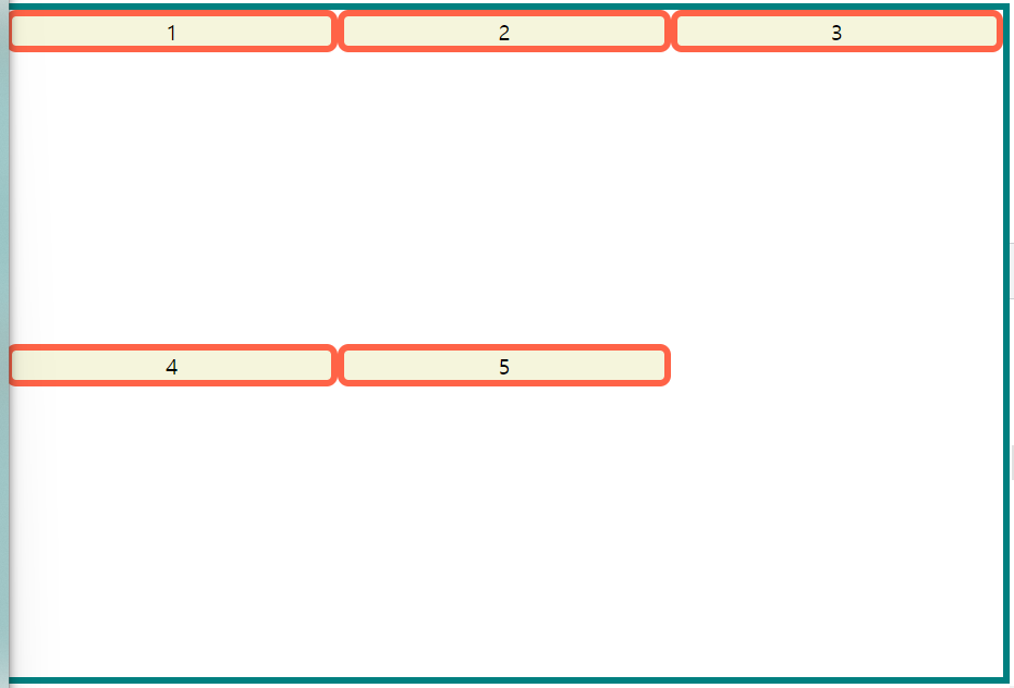
align-items: end;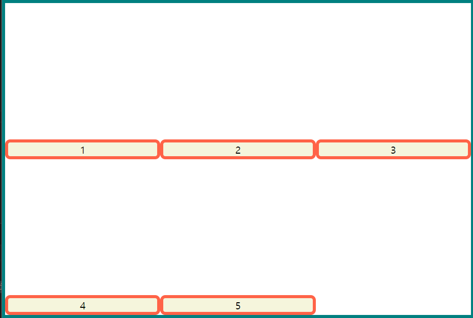
align-items: center;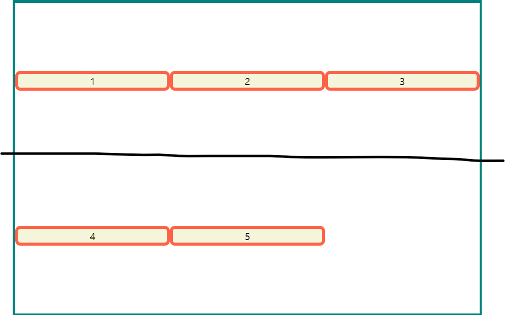
grid item에 align-self
.container{
  display: grid;
  height: 500px;

  grid-template-columns: repeat(3, 1fr);
  grid-template-rows: repeat(2, 1fr);

}
li:nth-child(1){ align-self: start; }
li:nth-child(2){ align-self: center; }
li:nth-child(3){ align-self: end; }
li:nth-child(4){ }
li:nth-child(5){ }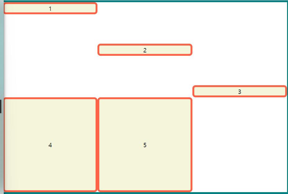
align-self는 각 item에 지정해주는 속성인 점 체크!
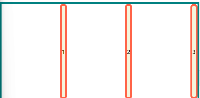
grid container에 justify-items
.container{
  display: grid;
  height: 500px;

  grid-template-columns: repeat(3, 1fr);
  grid-template-rows: repeat(2, 1fr);

  justify-items: stretch;

}
기본 값으로 아무 변화가 없다. item의 너비만큼 자리를 자치함!
justify-item: start;
justify-item: end;
justify-item: center;
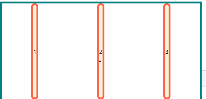
grid item에 justify-self
.container{
  display: grid;
  height: 500px;

  grid-template-columns: repeat(3, 1fr);
  grid-template-rows: repeat(2, 1fr);

}
li:nth-child(1){ justify-self: start; }
li:nth-child(2){ justify-self: end; }
li:nth-child(3){ justify-self: center; }
li:nth-child(4){ }
li:nth-child(5){ }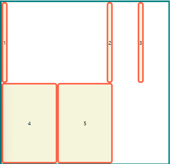
참고🖇️