
Notice
Recent Posts
Link
| 일 | 월 | 화 | 수 | 목 | 금 | 토 |
|---|---|---|---|---|---|---|
| 1 | 2 | 3 | 4 | 5 | ||
| 6 | 7 | 8 | 9 | 10 | 11 | 12 |
| 13 | 14 | 15 | 16 | 17 | 18 | 19 |
| 20 | 21 | 22 | 23 | 24 | 25 | 26 |
| 27 | 28 | 29 | 30 |
Tags
- JS form
- JS redirection
- JS 타이머기능
- JS 연산
- JS append
- JS setInterval
- JS form action
- JS prompt
- JS 함수
- JS 기초
- JS appendChild
- JS preventDefault
- JS typeof연산자
- JS 삼항연산
- JS clearInterval
- js 변수
- JS null undefined
- CSS기초
- JS 데이터타입
- HTML기초
- JS 화살표함수
- JS 숫자
- JS 형변환
- JS 스코프
- git 협업셋팅
- JS value속성
- CSS속성정리
- JS classList
- JS setTimeout
- JS localStorage
Archives
공부기록용
CSS 기초 06(grid속성 grid-template-columns/rows, grid-gap응용) 본문
트랙관련함수
grid container의 트랙(행과 열) 크기를 지정할 때 사용할 수 있는 유용한 함수들이 있다.
- repeat( ) : 반복되는 값을 자동으로 처리할 수 있는 함수
- minmax( ) : 최솟값과 최댓값을 각각 지정할 수 있는 함수
- auto - fill & auto - fit : 반응형을 고려해 사용할 수 있는 키워드(함수❌)
⭐내용실습⭐
<!-- index.html-->
<!DOCTYPE html>
<html lang="en">
<head>
    <meta charset="UTF-8">
    <meta name="viewport" content="width=device-width, initial-scale=1.0">
    <link rel="stylesheet" href="style.css" />
    <title>그리드 레이아웃</title>
</head>
<body>
    <ul class="container">
        <li class="item">1</li>
        <li class="item">2</li>
        <li class="item">3</li>
        <li class="item">4</li>
        <li class="item">5</li>
    </ul>
</body>
</html>
/*style.css*/
*{
box-sizing: border-box;
}
body{
margin: 0;
}
ul{
padding: 0;
list-style-type: none;
border: 5px solid teal;
}
li{
display: flex;
justify-content: center;
align-items: center;
background-color: beige;
border: 5px solid tomato;
border-radius: 8px;
}
.container{
display: grid;
height: 500px;
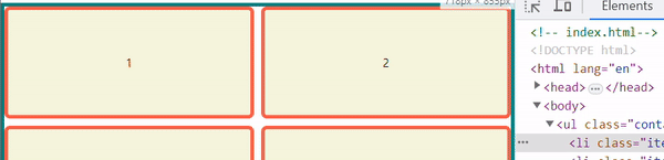
grid-template-columns: 100px 100px 100px;
gap: 10px
}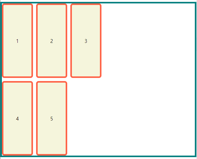
grid-template-columns: 100px 100px 100px;>이렇게 각각으로 3개의 행을 만들고 크기를 각각 지정할 수도 있지만
repeat( )
grid-template-columns: repeat(3, 100px);> repeat( ) 함수를 사용해서 인자로 갯수, 크기를 지정해주면 중복으로 값을 넣을 필요가 없다.
.container{
  display: grid;
  height: 500px;

  grid-template-columns: repeat(2, 100px);
  grid-template-rows: repeat(3, 100px);

  gap: 10px
}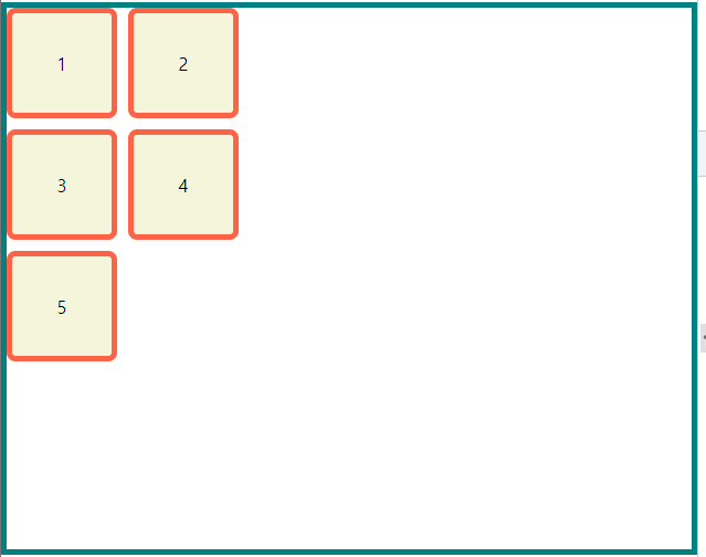
> grid-template-rows: repeat(3, 100px); 에도 마찬가지로 적응이 가능하다.
grid-template-columns: repeat(2, 1fr);
grid-template-rows: repeat(3, 1fr);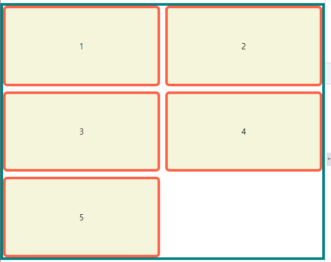
> fr역시도 사용 가능하다.
minmax( )
을 사용해서 좀 더 유연하게 만들어 볼 수 있다.
.container{
  display: grid;
  height: 500px;

  grid-template-columns: repeat(2, minmax(100px, 200));
  grid-template-rows: repeat(3, 1fr);

  gap: 10px
}
minmax(최소길이, 최대길이)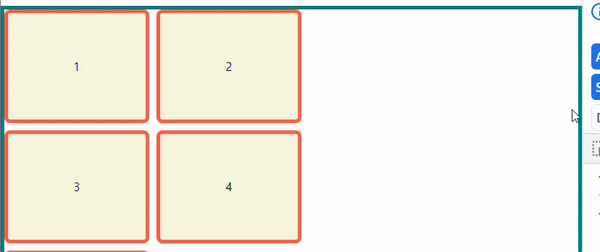
> minmax(100px, 200px)로 최대로 늘리면 200px이 되고, 최대로 줄이면 100px이 되는 것을 확인해 볼 수 있다.
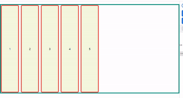
grid-template-columns: repeat(2, minmax(100px, auto));> fr이나 auto로도 가능하며, auto의 경우
> 최소 값으로 100을 주어서 줄어들면 최소 100까지 줄어들게 되고 최대를 auto로 함으로써 구애 받지 않고 화면의 크기만큼 계속 늘어가는 것을 볼 수 있다.
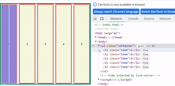
auto - fill & auto - fit
repeat( )의 첫 번째 인자로 사용하는 키워드이며, auto - fill은 트랙의 최소 길이의 합보다 컨테이너의 길이가 훨씬 길어진 경우에 빈 공간을 남기고, auto - fit은 채운다.
.container{
  display: grid;
  height: 500px;

  grid-template-columns: repeat(auto-fill, minmax(100px, auto));

  gap: 10px
}
.container{
  display: grid;
  height: 500px;

  grid-template-columns: repeat(auto-fit, minmax(100px, auto));

  gap: 10px
}
참고🖇️
'📚강의록📚 > 유노코딩)CSS' 카테고리의 다른 글
| CSS 기초 06(grid속성 grid-template-areas/grid-area) (0) | 2023.08.03 |
|---|---|
| CSS 기초 06(grid속성 grid-column, row) (0) | 2023.08.03 |
| CSS 기초 06(grid속성 grid-template-columns/rows, grid-gap) (0) | 2023.08.02 |
| CSS 기초 06(grid란) (0) | 2023.08.02 |
| CSS 기초 05(flex속성 order) (0) | 2023.08.02 |
Comments