
Notice
Recent Posts
Link
| 일 | 월 | 화 | 수 | 목 | 금 | 토 |
|---|---|---|---|---|---|---|
| 1 | 2 | 3 | 4 | 5 | 6 | 7 |
| 8 | 9 | 10 | 11 | 12 | 13 | 14 |
| 15 | 16 | 17 | 18 | 19 | 20 | 21 |
| 22 | 23 | 24 | 25 | 26 | 27 | 28 |
| 29 | 30 | 31 |
Tags
- JS localStorage
- JS clearInterval
- CSS기초
- JS preventDefault
- git 협업셋팅
- JS redirection
- JS 기초
- JS appendChild
- JS typeof연산자
- JS setInterval
- JS 화살표함수
- JS prompt
- JS 숫자
- JS null undefined
- JS classList
- JS 데이터타입
- JS 연산
- HTML기초
- JS 타이머기능
- js 변수
- JS 함수
- JS append
- JS setTimeout
- JS form action
- JS value속성
- JS 삼항연산
- JS form
- JS 스코프
- JS 형변환
- CSS속성정리
Archives
공부기록용
CSS 기초 06(grid속성 grid-template-areas/grid-area) 본문
🔴grid-template-areas
🔴grid-area
grid-template-areas
grid 영역 즉, item의 이름을 이용해 layout의 형태를 정의할 수 있다.
grid-area
grid 영역 즉, item의 이름을 지정할 때 사용하는 속성이다.
grid-area 속성은 CSS 그리드 레이아웃에서 사용되는 속성으로, 그리드 셀의 행과 열을 한 번에 지정하여 그리드 아이템의 위치와 범위를 설정하는 데 사용되기도 한다. 이를 통해 요소를 그리드 컨테이너 내에서 원하는 위치와 크기로 배치할 수 있습니다.
요소 {
  grid-area: 행 시작 / 열 시작 / 행 끝 / 열 끝;
}

/*
행 시작: 요소가 시작하는 행의 위치를 나타냅니다. grid-row-start
열 시작: 요소가 시작하는 열의 위치를 나타냅니다. grid-column-start
행 끝: 요소가 끝나는 행의 위치를 나타냅니다. grid-row-end
열 끝: 요소가 끝나는 열의 위치를 나타냅니다. grid-column-end
*/⭐내용실습⭐
<!-- index.html-->
<!DOCTYPE html>
<html lang="en">
<head>
    <meta charset="UTF-8">
    <meta name="viewport" content="width=device-width, initial-scale=1.0">
    <link rel="stylesheet" href="style.css" />
    <title>그리드 레이아웃</title>
</head>
<body>
    <ul class="container">
        <li class="item">1</li>
        <li class="item">2</li>
        <li class="item">3</li>
        <li class="item">4</li>
        <li class="item">5</li>
    </ul>
</body>
</html>
/*style.css*/
*{
box-sizing: border-box;
}
body{
margin: 0;
}
ul{
padding: 0;
list-style-type: none;
border: 5px solid teal;
}
li{
display: flex;
justify-content: center;
align-items: center;
background-color: beige;
border: 5px solid tomato;
border-radius: 8px;
}
.container{
display: grid;
height: 500px;
}
li:nth-child(1){grid-area: a;}
li:nth-child(2){grid-area: b;}
li:nth-child(3){grid-area: c;}
li:nth-child(4){grid-area: d;}
li:nth-child(5){grid-area: e;}각 item들의 위치를 지정하지 않아 불완전한 상태이며, 우선 li들에 영역에서 각 li들이 불려질 이름을 설정한 것이다.
.container{
  display: grid;
  height: 500px;

  grid-template-columns: repeat(3, 1fr);
}
grid-template-columns: repeat(3, 1fr);grid-template-columns를 사용해서 열과 크기를 잡아주고,
.container{
  display: grid;
  height: 500px;

  grid-template-columns: repeat(3, 1fr);

  grid-template-areas:
  "a a a"
  "b b b"
  "c c d"
  "e e e";
}
grid-template-areas:
"a a a"
"b b b"
"c c d"
"e e e";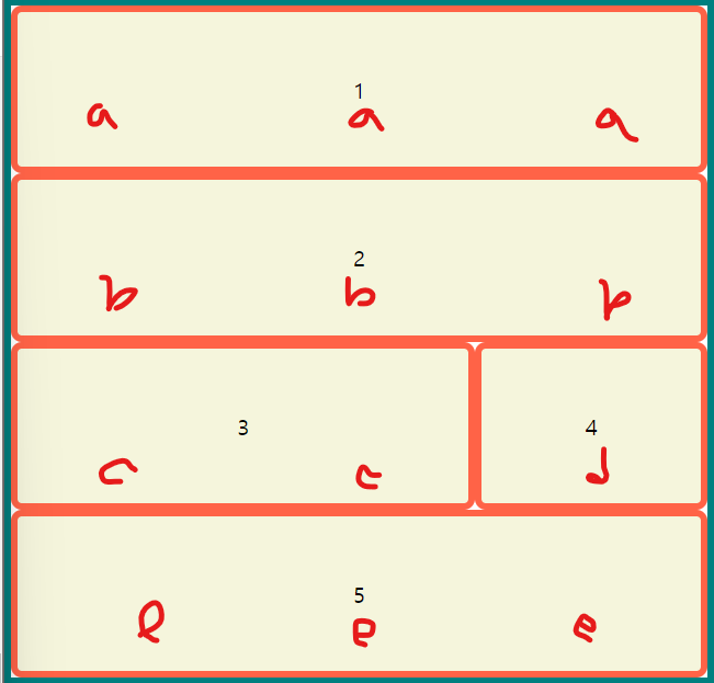
grid-template-areas의 속성 값을 사용해서 item의 배치를 잡아준다.
위에 사용한 grid-template-columns이나 rows는 사용하지 않아도 된다. 다만 item을 원하는 크기로 지정할 때는 해당 속성을 사용해서 값을 지정해 주어야 크기가 지정되며 사용하지 않는 경우 원하는 크기로 지정되지 않고 단순히 일정 크기로 나누어져 배치가 되고 크기는 auto로 화면의 비율대로 줄었다 늘었다 한다 생각하면 된다.
문자열의 공백은 상관이 없으며, 빈 공간으로 두고 싶은 경우 ( . )를 사용하면 된다.
  grid-template-areas:
  "a a a"
  "b b ."
  "c c d"
  "e e e";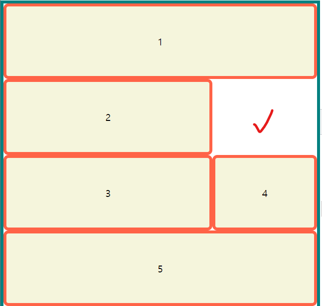
참고🖇️
'📚강의록📚 > 유노코딩)CSS' 카테고리의 다른 글
| CSS 기초 06(grid속성 align-content/justify-content) (0) | 2023.08.03 |
|---|---|
| CSS 기초 06(grid속성 align-items, self/justify-items, self) (0) | 2023.08.03 |
| CSS 기초 06(grid속성 grid-column, row) (0) | 2023.08.03 |
| CSS 기초 06(grid속성 grid-template-columns/rows, grid-gap응용) (0) | 2023.08.03 |
| CSS 기초 06(grid속성 grid-template-columns/rows, grid-gap) (0) | 2023.08.02 |
Comments