
Notice
Recent Posts
Link
| 일 | 월 | 화 | 수 | 목 | 금 | 토 |
|---|---|---|---|---|---|---|
| 1 | 2 | 3 | 4 | 5 | ||
| 6 | 7 | 8 | 9 | 10 | 11 | 12 |
| 13 | 14 | 15 | 16 | 17 | 18 | 19 |
| 20 | 21 | 22 | 23 | 24 | 25 | 26 |
| 27 | 28 | 29 | 30 |
Tags
- JS form action
- JS value속성
- JS 스코프
- JS redirection
- JS form
- JS 연산
- JS 숫자
- JS append
- JS 화살표함수
- CSS속성정리
- JS setInterval
- JS 타이머기능
- JS 함수
- JS preventDefault
- JS localStorage
- git 협업셋팅
- JS setTimeout
- JS 형변환
- JS typeof연산자
- JS 기초
- js 변수
- JS prompt
- JS 데이터타입
- HTML기초
- JS classList
- CSS기초
- JS clearInterval
- JS 삼항연산
- JS null undefined
- JS appendChild
Archives
공부기록용
CSS 기초 05(flex속성 justify-content) 본문
🔴justify-content
justify-content
flex item들이 flexbox의 주축을 따라 배치될 때, 요소 사이의 공간을 분배하는 방식을 결정한다.

⭐내용실습⭐
<!-- index.html-->
<!DOCTYPE html>
<html lang="en">
<head>
<meta charset="UTF-8">
<meta name="viewport" content="width=device-width, initial-scale=1.0">
<link rel="stylesheet" href="style.css" />
<title>플렉스 박스</title>
</head>
<body>
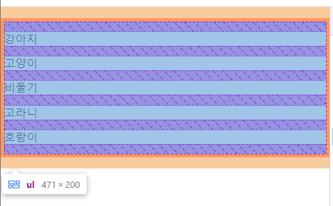
<ul>
<li>강아지</li>
<li>고양이</li>
<li>비둘기</li>
<li>고라니</li>
<li>호랑이</li>
</ul>
</body>
</html>/*style.css*/
*{
box-sizing: border-box;
}
body{
margin: 0;
}
ul{
padding: 0;
list-style-type: none;
display: flex;
height: 200px;
border: 5px solid red;
}justify-content: flex-start;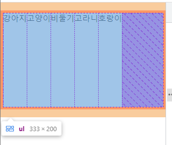
justify-content: flex-end;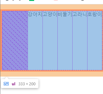
> ul의 순서는 유지하지만 배치가 뒤쪽으로 붙게 되었다. 역순❌
justify-content: center
> 중앙에 flex item들이 배치되어있는걸 볼 수 있다.
justify-content: space-around
> 각각의 모든 item들이 좌우로 같은 간격을 가지게 되는 것이다.
>> 강아지의 좌우여백이 같다, 고양이의 좌우여백이 같다는 의미
justify-content: space-between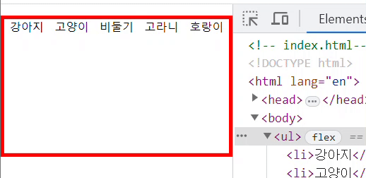
> 양 끝 여백없이 요소들 사이의 간격이 일정하다.
justify-content: space-evenly;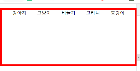
> 양 끝을 포함한 모든 여백이 동일하다.
> flex container자체적으로 요소들 사이의 간격을 동일하게 만든다.
>> around랑 evenly랑 비슷해 보이니 주의!
justify-content는 컨테이너의 주축방향에 따라 itme의 배치를 고려하는 것이다. 다만, 컨테이너의 주축이 가로지만 flex-direction: column; 을 사용하여 세로로 바뀐다면, 그에 맞게 justify-content로 인한 배치들도 세로가 기준이 되어 적용된다.
/*style.css*/
*{
  box-sizing: border-box;
}
body{
  margin: 0;
}
ul{
  padding: 0;
  list-style-type: none;
  display: flex;
  height: 200px;
  border: 5px solid red;

  flex-direction: column;

  justify-content: space-evenly;
}
참고🖇️
'📚강의록📚 > 유노코딩)CSS' 카테고리의 다른 글
| CSS 기초 05(flex속성 flex-grow, shrink) (0) | 2023.07.31 |
|---|---|
| CSS 기초 05(flex속성 align-items, self, content) (0) | 2023.07.31 |
| CSS 기초 05(flex속성 flex-direction/wrap/flow) (0) | 2023.07.31 |
| CSS 기초 05(flexbox란) (0) | 2023.07.28 |
| CSS 기초 04(의사클래스, 의사요소) (0) | 2023.04.19 |